
Reduce churn by detecting at-risk cohorts in real time
By the time a customer cancels, the warning signs have been in your data for weeks — declining logins, unanswered support tickets, billing disputes. Most teams catch them too late because no human has time to watch every account every day.
The Problem
By the time a customer cancels, the warning signs have been in your data for weeks. Logins quietly drop. The power user stops opening the weekly report. A support ticket sits unanswered for 11 hours instead of the usual 40 minutes. Billing fails on the second retry, and the account team learns about it from the cancellation email.
Most teams deal with this in one of three ways, and each has a known failure mode.
1. The CSM-driven playbook. Customer Success Managers manually scan a list of accounts every Monday, eyeball usage trends, and pick three to call. This works at 30 accounts per CSM. It collapses at 200 — the long tail goes uncalled, and the cohort that needed attention is exactly the long tail.
2. The dashboard. A central "customer health" dashboard with a colored score per account. Beautifully built, lovingly maintained. Nobody opens it after week three because it shows the same 800 rows in roughly the same colors every day. Signal-to-noise is too low to drive action.
3. The SQL-rule alert. "Email me if any account's logins drop more than 40% week-over-week." Fires 60 alerts on Monday because of the holiday weekend. The team mutes the channel by Friday.
All three fail for the same underlying reason: they treat churn detection as a reporting problem when it's actually a ranking and routing problem. You don't need every signal — you need the right twenty rows on the right rep's desk every morning, with one sentence explaining why.
⚠ All numbers below use illustrative mock data. Real client deployments are confidential.
The DataCraves Approach
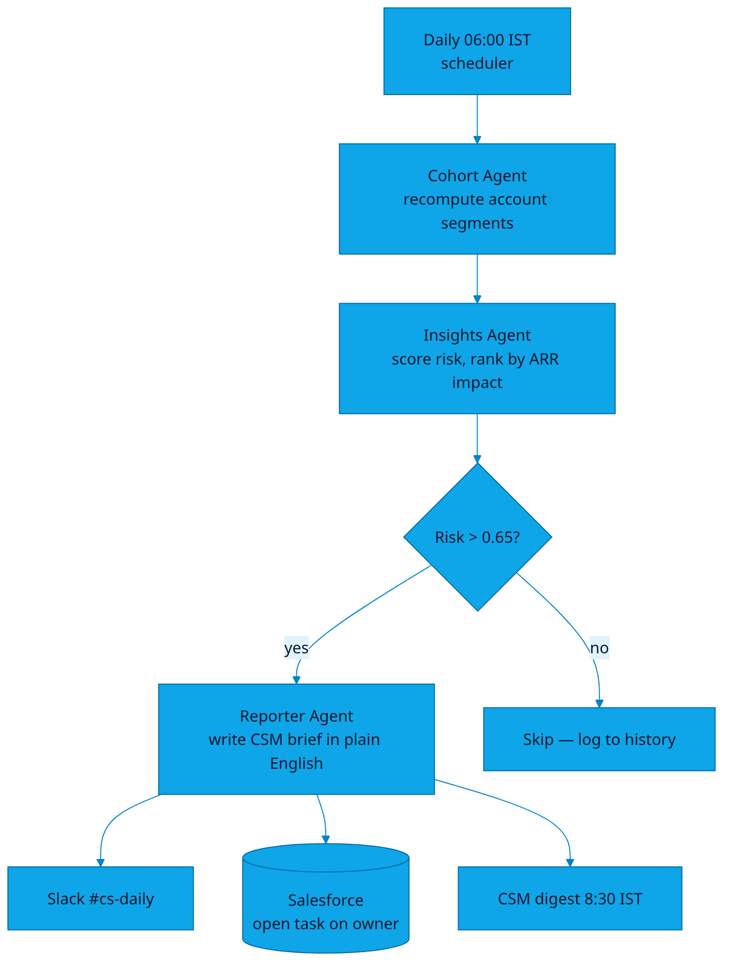
The Cohort Agent and the Insights Agent run in series, fed by a feature store built on top of your warehouse. Every account gets a fresh churn-risk score every morning, ranked by ARR-at-risk. The top twenty land in the right CSM's Slack DM at 8:30 IST, each with a one-sentence explanation of which signal moved.
Data sources
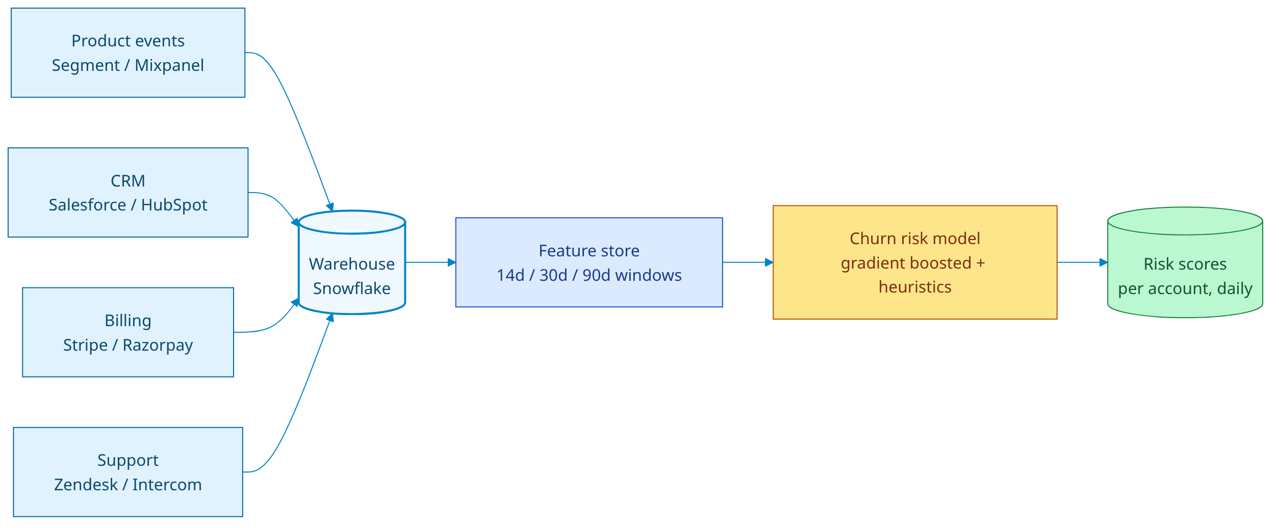
- Product events — Segment, Mixpanel, Amplitude, or your own warehouse tables. We read
session_start,feature_used,page_viewed,action_completed. - CRM — Salesforce, HubSpot, or Pipedrive. We pull account stage, owner, ARR, contract end date, last touch.
- Billing — Stripe, Razorpay, or Chargebee. We watch failed payments, downgrades, seat removals.
- Support — Zendesk, Intercom, or HubSpot Service. Ticket count, avg response time, sentiment, NPS.
Agents in the loop
- Cohort Agent recomputes account segments nightly using unsupervised clustering (HDBSCAN on a 32-dim activity embedding). New cohorts surface the moment usage patterns shift.
- Insights Agent scores each account on a churn-risk model (gradient-boosted trees, retrained nightly on the last 18 months of cancels), then ranks by
risk × ARR × renewal_window. - Reporter Agent writes the per-account brief: which signal moved, by how much, and what the rep should mention on the call.
The Architecture
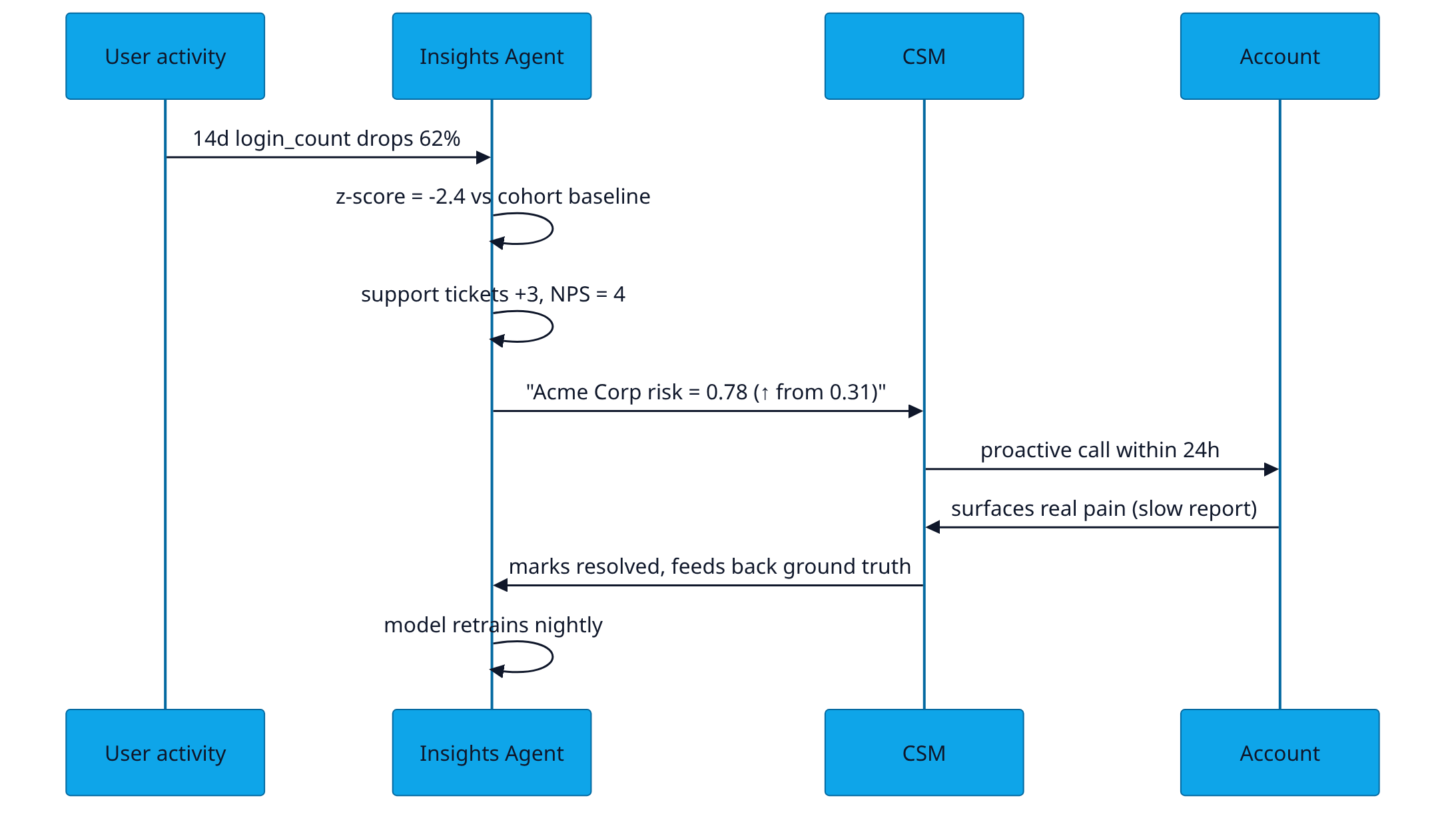
Three flows make the system tick: data ingestion, agent orchestration, and output delivery. Each is intentionally small — every box does one job and hands the result to the next.
The Dashboard
CSMs work out of one screen. KPIs at the top track the health of the book; the cohort drift and risk-by-tier panels surface where attention is needed; the bottom strip lists the twenty accounts to call today.
The Math / The Logic
The risk score is a calibrated probability, but the features under it are deliberately interpretable so a CSM can read them on a brief. The five highest-importance features in the production model:
- Activity-decay z-score (14d).
z = (rolling_14d_sessions − cohort_baseline) / cohort_std. A z below −2 contributes ~28% of the score on average. - Session-density delta. Sessions per active day, this week vs trailing 8w. Catches "still logs in but does nothing".
- Power-user dropoff. Did the top-3 users on the account go quiet? Power-user signal is 3× stronger than overall account signal.
- Support velocity ratio.
median_response_time_this_month / median_response_time_trailing_3m. Slowed support → frustrated customer. - Billing friction events. Failed charges, downgrades, seat reductions, invoice disputes. Each one carries a fixed +0.08 to the risk score.
The model itself is an XGBoost classifier trained on the last 18 months of churn labels, with class weights to compensate for the ~4% positive rate. We use monotone_constraints to keep "more failed payments → more risk" monotonic, because non-monotonic risk scores are impossible to defend in front of a CSM.
# churn_score.py — simplified production scorer
from dataclasses import dataclass
import numpy as np
import xgboost as xgb

@dataclass
class AccountFeatures:
    activity_z14:        float     # z-score, 14d window
    session_density_d:   float     # delta vs 8w baseline
    power_user_dropoff:  float     # 0..1
    support_vel_ratio:   float     # this_mo / trailing_3mo
    billing_friction:    int       # count last 90d
    nps_last:            int       # 0..10, -1 if missing
    contract_days_left:  int

def score(model: xgb.Booster, x: AccountFeatures) -> float:
    v = np.array([[
        x.activity_z14, x.session_density_d, x.power_user_dropoff,
        x.support_vel_ratio, x.billing_friction, x.nps_last,
        np.log1p(max(x.contract_days_left, 0)),
    ]])
    p = model.predict(xgb.DMatrix(v))[0]
    # Calibration: isotonic-regressed on hold-out
    return float(np.clip(p, 0.01, 0.99))

def priority(p: float, arr: float, days_left: int) -> float:
    # Reps work the top of this ranked list every morning.
    urgency = 1.0 + max(0, (90 - days_left)) / 90
    return p * arr * urgency
Sample Output / Insight
This is what a CSM sees in Slack at 8:30 IST. Plain English, ranked by ARR-at-risk, with the one-line "why" the model would explain it to itself.
Top 3 at-risk accounts for you today (book: SMB-East).
1. Acme Corp · $42K ARR · risk 0.78 (↑ from 0.31)
14-day session count down 62% (z = −2.4). The two power users haven't logged in for 9 days. Two open support tickets, both age > 36h. Suggested play: proactive call today; lead with the unanswered tickets.
2. Northbridge Labs · $28K ARR · risk 0.71 (↑ from 0.42)
Renewal in 41 days. Seats reduced from 18 → 14 last month. Activity steady on remaining seats. Suggested play: usage review, surface ROI of removed seats.
3. Plover Analytics · $19K ARR · risk 0.69 (new on list)
First failed payment retry yesterday + NPS dropped 8 → 4 last week. Suggested play: billing handoff before the cancel email lands.
Seventeen more in the dashboard. Reply 'snooze 3' to push any account out 3 days.
ROI Math
Honest math, with assumptions stated up front. Numbers below mirror a representative mid-market SaaS pilot (illustrative).
- Baseline. 1,200 paying accounts, $3.5M ARR, 4.5% monthly logo churn, average ACV $2.9K.
- Without DataCraves. 54 churned logos / month × $2.9K = $157K ARR / month at risk.
- With DataCraves. Pilot data shows ~35% reduction in voluntary churn after 8 weeks ramp. New rate ≈ 2.9% monthly logo churn.
- Saved per month. (4.5% − 2.9%) × 1,200 × $2.9K = ~$56K ARR / month preserved.
- Annualised. ~$672K ARR retained vs DataCraves Pro at ₹4,999/mo (~$60/mo). Payback ≈ Day 1.
Assumptions to challenge: 35% reduction is the 60th percentile of pilots — bottom decile is 12%, top decile is 51%. Books with mature playbooks already see less lift. Books with no current churn motion see the most.
Common Pitfalls
Based on early pilot deployments at 2 Series-B SaaS companies, baseline churn 4–6% monthly.
Run this on your own data?
A 30-minute demo shows the agents working against your warehouse — not a pre-baked sandbox.
Book a demo →Mock data, real patterns. Every visualization is synthetic to preserve client confidentiality.